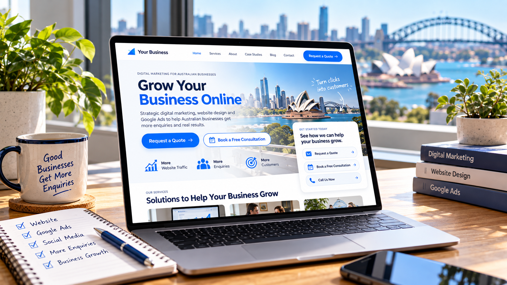
A business website should do more than provide information. It should help visitors understand what to do next, whether that means requesting a quote, booking a consultation, or contacting the business. Without clear direction, even an informative website can struggle to turn visitors into enquiries.
This is where calls to action play an important role. A well-written and strategically placed call to action helps visitors navigate a website, understand their options, and take the next step with confidence.
For businesses investing in website design and development, clear calls to action should be part of the overall website strategy. They connect useful content with meaningful actions, helping businesses make better use of their website traffic.
What Is a Call to Action and Why Does It Matter?
A call to action (CTA) is a prompt that encourages a website visitor to complete a specific action. It commonly appears as a button, text link, or short instruction that directs visitors towards the next step.
Examples include:
- Get a Quote
- Book a Consultation
- Contact Our Team
- Download the Guide
- Request More Information
The purpose of a CTA is to make the next step clear. Rather than leaving visitors to decide where to go, it provides a direct path towards an action that supports their needs.
For service-based businesses, this could mean encouraging a potential customer to request a quote or arrange an initial conversation. For businesses offering downloadable resources, the CTA might invite visitors to access a guide or subscribe to updates.
Understanding what a call to action is can help businesses recognise how these prompts support customer engagement and guide visitors through a website.
A website can attract visitors through search engines, advertising, and social media, but traffic alone does not guarantee enquiries. Clear website calls to action help connect those visits with the outcomes a business wants to achieve.
How Clear Calls to Action Help Visitors Make Decisions
Website visitors often arrive with different questions and levels of interest. Some are researching their options, while others are comparing providers or preparing to make an enquiry.
Clear calls to action help visitors understand the next available step without forcing them to search through multiple pages.
For example, someone reading a service page may want to understand the cost of a project. A visible “Request a Quote” button provides a straightforward next step. Someone who is still exploring may prefer to read more about the service before making contact.
When a CTA matches the information visitors are looking for, it can make the website experience more intuitive. Visitors can move forward at their own pace while having a clear path available when they are ready.
This is particularly important for businesses offering services that require consideration before a purchase. A well-placed prompt can help visitors progress from researching a problem to exploring a solution and eventually making an enquiry.
The aim is not to pressure every visitor into taking immediate action. Instead, effective calls to action make relevant next steps easy to find and understand.
Choosing the Right Call to Action for Your Business Goals
The right CTA depends on what a business wants visitors to do and what those visitors need at that point in their journey.
A business focused on generating qualified enquiries may use “Request a Quote” or “Discuss Your Project”. A professional service provider may encourage visitors to “Book a Consultation”, while a business offering a specific service could use “Explore Our Services” to help visitors learn more before contacting the team.
Before choosing a CTA, consider the purpose of the page. A service page should make it easy to enquire about that service, while an educational blog post may direct readers towards a related resource or relevant service page.
The wording should also reflect the commitment involved. Asking someone to book a consultation is different from inviting them to read a guide. Matching the CTA to the level of interest can make the next step feel more appropriate.
The destination matters, too. A button should take visitors directly to the relevant page, booking system, or form rather than leaving them to work out where to go.
Businesses can also improve the journey by optimising contact forms so visitors can submit their details without unnecessary steps. A clear CTA can attract an enquiry, but the form that follows should make completing that enquiry straightforward.
Writing CTA Copy That Encourages Visitors to Act
Effective call-to-action copy is clear, specific, and easy to understand. Visitors should be able to tell what action they are taking and what is likely to happen next.
Generic wording such as “Click Here” provides little information about the destination. More specific alternatives, such as “View Our Services” or “Request a Quote”, communicate the purpose of the action more clearly.
The wording should also reflect the value of taking that step. For example, “Book a Consultation” tells visitors what they can do, while a short supporting sentence can explain what the consultation is intended to help them achieve.
Keep CTA copy concise. Long button labels can be difficult to scan, particularly on mobile devices. Supporting text can provide additional context without making the button itself complicated.
Consistency with the surrounding content is equally important. If a page explains a particular service, the CTA should relate directly to that service rather than sending visitors towards an unrelated offer.
For further ideas, HubSpot’s guide to call-to-action copy explores different ways to phrase prompts that encourage visitors to take action.
CTA wording should also fit within the wider website content strategy. When the content and CTA work together, visitors can move naturally from learning about a problem to exploring a relevant solution.
Where to Place Calls to Action on Your Website
CTA placement affects how easily visitors can find the next step. Rather than placing buttons randomly, businesses should consider what visitors are likely to need as they move through each page.
Homepage: A homepage should help visitors understand what the business offers and where to go next. A primary CTA, such as “Explore Our Services” or “Contact Us”, can direct visitors towards a relevant page. The overall homepage structure should make the main action easy to identify without competing with too many alternatives.
Service pages: Visitors on service pages are often looking for specific information. A CTA such as “Request a Quote” or “Discuss This Service” can provide a direct route to an enquiry once visitors have enough information to consider taking action.
Blog posts: Educational content can help visitors understand a problem or explore possible solutions. A relevant CTA near the end of the article can guide readers towards a related service, resource, or contact page. The action should connect naturally with the topic they have just read.
Contact pages: Visitors who reach a contact page are already considering getting in touch. Clear contact details, a straightforward form, and a visible submission button can help them complete the process.
CTAs may appear more than once on a longer page, but each placement should serve a purpose. Repeating the same button without considering the content can make a page feel cluttered. The priority is to make the next step available when it is relevant.
How Website Design Makes Calls to Action More Effective
CTA performance depends on more than the words on a button. Website design helps determine whether visitors notice the prompt, understand its purpose, and can use it comfortably.
Visual contrast: CTA buttons should stand out from surrounding content. Appropriate contrast between the button and the page background makes the action easier to identify. The design should remain consistent with the brand while ensuring the button is visible.
Whitespace and layout: Giving a CTA enough space helps separate it from surrounding text and other elements. A crowded layout can make important actions harder to notice.
Mobile usability: Buttons need to be easy to tap on smaller screens. Text should remain readable, and the button should not be positioned so closely to other interactive elements that visitors accidentally select the wrong option.
Consistency: Using a consistent button style for similar actions helps visitors recognise clickable elements throughout the website. Primary actions should also be visually distinct from secondary links.
Businesses should consider these details as part of the broader website experience. When existing design choices make important actions difficult to find or use, it may be worth reviewing the site’s structure and website limitations that could be affecting usability.
Common CTA Mistakes That Can Discourage Visitors
Even when a website includes calls to action, certain mistakes can make them less effective.
Using vague wording: Labels such as “Submit” or “Click Here” may not explain the value or destination of an action. More specific wording helps visitors understand what to expect.
Including too many competing actions: Several prominent buttons competing for attention can make it harder for visitors to identify the main next step. Prioritise the action most relevant to the page, with secondary options presented less prominently where appropriate.
Making promises the next step cannot deliver: A CTA should accurately represent what happens after someone clicks. If a button promises an instant quote but leads to a lengthy enquiry form, the experience may not meet expectations.
Ignoring mobile visitors: Buttons that are difficult to tap, poorly positioned, or hidden within a crowded mobile layout can create unnecessary friction.
Sending visitors to irrelevant pages: The destination should match the CTA. A button about a particular service should take visitors to information or an enquiry path related to that service.
Asking for too much information too soon: A long form can discourage people who are not yet ready to provide extensive details. Request only the information needed for the next step, then collect additional details when appropriate.
Reviewing these issues can help businesses make their website easier to navigate and reduce obstacles between a visitor’s interest and a completed action.
How to Measure and Improve CTA Performance
Businesses should evaluate calls to action using measurable outcomes rather than relying on appearance or assumptions alone.
Start by identifying what each CTA is intended to achieve. Depending on the page, this might include form submissions, phone calls, consultation bookings, downloads, or visits to a key service page.
Useful metrics include:
- CTA click-through rate: The proportion of visitors who click a particular CTA.
- Form completion rate: The proportion of visitors who start or view a form and successfully submit it, depending on how the measurement is configured.
- Conversion rate: The proportion of relevant visitors who complete the desired action.
- Lead quality: Whether the enquiries generated are relevant to the business’s services and target customers.
These metrics should be interpreted in context. A button may receive many clicks but generate few completed enquiries if the destination page is confusing or the form creates unnecessary friction.
Businesses can test different CTA wording, placements, and button designs to understand what works for their audience. Change one important element at a time where practical, and compare results over a suitable period with enough data to identify meaningful patterns.
It is also important to review the complete journey. If visitors click a CTA but do not complete the next step, the issue may lie in the landing page, form, page speed, or clarity of the offer rather than the button itself.
Regular measurement allows businesses to make informed improvements and align website calls to action with their wider lead-generation goals.
Frequently Asked Questions About Website Calls to Action
What is a good call to action for a business website?
A good CTA clearly communicates the next step and matches the page’s purpose. Examples include “Request a Quote”, “Book a Consultation”, and “Contact Our Team”. The right wording depends on the service and what visitors need.
Where should a CTA button be placed?
CTA buttons should appear where visitors are likely to need a clear next step, such as on the homepage, service pages, relevant blog posts, and contact page. Placement should follow the visitor’s journey rather than a fixed rule.
How many calls to action should a page have?
There is no universal number. A page should have a clear primary action, with additional CTAs used when they serve a distinct purpose. Avoid presenting too many competing actions at the same visual prominence.
Do CTA buttons improve website conversions?
Clear, relevant, and easy-to-use CTA buttons can help visitors take the intended next step. However, conversions also depend on factors such as the offer, page content, visitor intent, trust, usability, and the process after the click.
Turn Clear Calls to Action into More Opportunities
Clear calls to action help turn a website from a place where visitors simply browse into a practical tool for generating enquiries and supporting business growth. The right wording, placement, and design can make it easier for visitors to understand their options and take the next step.
For Australian businesses, effective CTAs should work alongside useful content, intuitive navigation, and a website experience that supports the customer’s needs. Regularly reviewing performance can also reveal where visitors are encountering difficulties and where improvements may help.
If your website attracts visitors but does not generate the enquiries you expect, it may be time to review how your pages guide people towards action.
Contact us today to discuss how your website can better support your business goals.